本篇文章由 VeriMake 旧版论坛中备份出的原帖的 Markdown 源码生成
原帖标题为:Python Implementation on "Storytelling with Data"——Figure 2.2
原帖网址为:https://verimake.com/topics/161 (旧版论坛网址,已失效)
原帖作者为:Felix(旧版论坛 id = 28,注册于 2020-04-18 19:59:47)
原帖由作者初次发表于 2020-09-20 20:40:29,最后编辑于 2020-09-20 20:40:29(编辑时间可能不准确)
截至 2021-12-18 14:27:30 备份数据库时,原帖已获得 822 次浏览、0 个点赞、0 条回复
Introduction
When you have just a number or two to share, simple text can be a great way to communicate.
Comparison
Bar chart:
Simple text:
Code
Bar chart
# import modules
import pandas as pd
import numpy as np
import matplotlib as mpl
import matplotlib.pyplot as plt
import matplotlib.patches as mpathes
plt.style.use('seaborn-whitegrid')
# import data
data = pd.read_csv('D:/programming/dataset/data.csv')
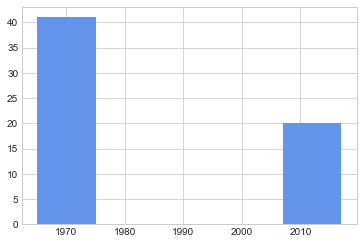
# first method to draw a bar chart
plt.bar(data['year'], data['percentage'], width=10, color='cornflowerblue')
# second method to draw a bar chart
fig, ax = plt.subplots()
# create two points where bottoms of two bar locate
point1 = np.array([0.2, 0.2])
point2 = np.array([0.6, 0.2])
# set heights for two bars
h1 = data['percentage'][0] / 50 * 0.4
h2 = data['percentage'][1] / 50 * 0.4
# create two "rectangles" as bars [1]
rect1 = mpathes.Rectangle(point1, 0.2, h1, color='cornflowerblue')
rect2 = mpathes.Rectangle(point2, 0.2, h2, color='cornflowerblue')
ax.add_patch(rect1)
ax.add_patch(rect2)
# add texts based on position
# ax.text(x position, y position, string, fontsize, horizontalalignment, verticalalignment, color, style)
ax.text(point1[0] + 0.1, h1 + 0.2 + 0.02, str(data['percentage'][0]), fontsize=15, horizontalalignment='center')
ax.text(point2[0] + 0.1, h2 + 0.2 + 0.02, str(data['percentage'][1]), fontsize=15, horizontalalignment='center')
ax.text(point1[0] + 0.1, 0.2 - 0.02, str(data['year'][0]), fontsize=15, horizontalalignment='center', verticalalignment='top')
ax.text(point2[0] + 0.1, 0.2 - 0.02, str(data['year'][1]), fontsize=15, horizontalalignment='center', verticalalignment='top')
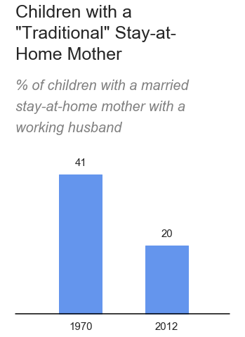
ax.text(0, h1 + 0.3, 'working husband', fontsize=20, c='grey', style='italic')
ax.text(0, h1 + 0.35, 'stay-at-home mother with a', fontsize=20, c='grey', style='italic')
ax.text(0, h1 + 0.4, '% of children with a married', fontsize=20, c='grey', style='italic')
ax.text(0, h1 + 0.47, 'Home Mother', fontsize=25)
ax.text(0, h1 + 0.52, '"Traditional" Stay-at-', fontsize=25)
ax.text(0, h1 + 0.57, 'Children with a', fontsize=25)
# add the line y = 0.2 as the x-axis
x = np.arange(0, 1, 0.01)
y = np.ones(len(x))
y = y * 0.2
ax.plot(x, y, c='black')
ax.axis('off')

Simple text:
# simple text
plt.figure(figsize=(4, 2))
plt.axis('off')
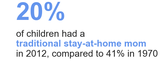
plt.text(0.2, 1.5, str(data['percentage'][1]) + '%', fontsize=80, weight='bold', color='cornflowerblue')
plt.text(0.2, 1, 'of children had a', fontsize=30)
plt.text(0.2, 0.7, 'traditional stay-at-home mom', fontsize=30, weight='bold', color='cornflowerblue')
plt.text(0.2, 0.4, 'in ' + str(data['year'][1]) + ', compared to ' + str(data['percentage'][0]) + '% in ' + str(data['year'][0]), fontsize=30)

References
[1] python-matplotlib-draw-shapes
 网站备案号:ICP备16046599号-1