本篇文章由 VeriMake 旧版论坛中备份出的原帖的 Markdown 源码生成
原帖标题为:Python Implementation on "Storytelling with Data"——Figure 2.5: Heatmap
原帖网址为:https://verimake.com/topics/165 (旧版论坛网址,已失效)
原帖作者为:Felix(旧版论坛 id = 28,注册于 2020-04-18 19:59:47)
原帖由作者初次发表于 2020-09-26 18:01:48,最后编辑于 2020-09-26 18:01:48(编辑时间可能不准确)
截至 2021-12-18 14:27:30 备份数据库时,原帖已获得 710 次浏览、0 个点赞、0 条回复
Introduction
"A heatmap is a way to visualize data in tabular format, where in place of the numbers, you leverage colored cells that convey the relative magnitude of the numbers".
Compared to tables, a heatmap helps "our eyes and brains more quickly target the potential points of interest". [1]
Code
Import modules
import pandas as pd
import numpy as np
import matplotlib
import matplotlib.pyplot as plt
Set style
plt.style.use('seaborn-whitegrid')
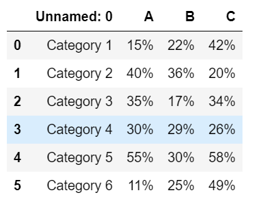
Import data
Raw data
# import raw data
data_raw = pd.read_csv('D:/programming/dataset/storytellingwithdata/project/data2.5.csv')
Raw data preview
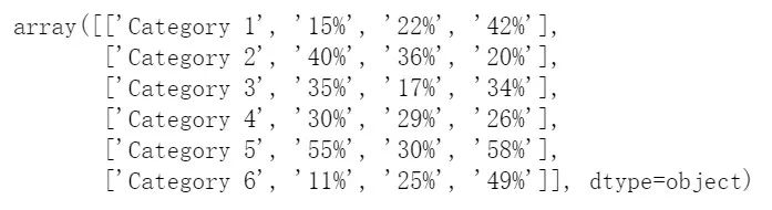
Processed data
# process data
data_pro = pd.DataFrame(data_raw).to_numpy()
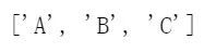
# create column list for column label
col = list(data_raw.columns)[1:]
Processed data and column list preview
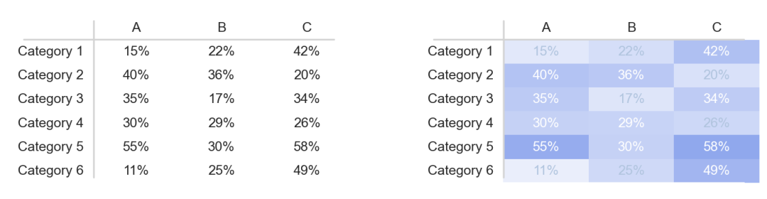
Plot
# create two subplots
fig, ax = plt.subplots(1, 2, figsize=(12, 3), dpi=150)

# draw table 1
table_1 = ax[0].table(data_pro, colLabels=[''] + col, cellLoc='center', loc=9)
table_1.set_fontsize(15)
# get all cells as an dictionary object, cell_dict[x, y] refers to row x col y cell
# for every cell, set height and linewidth
cell_dict_1 = table_1.get_celld()
for _row_ in range(0, 7):
    for _col_ in range(0, 4):
        cell_dict_1[(_row_, _col_)].set_height(.13)
        cell_dict_1[(_row_, _col_)].set_linewidth(0)

# draw table 2
table_2 = ax[1].table(data_pro, colLabels = ['']+col, cellLoc='center', loc=9)
table_2.set_fontsize(15)
# get all cells as an dictionary object, cell_dict[x, y] refers to row x col y cell
# for every cell, set height and linewidth
cell_dict_2 = table_2.get_celld()
for _row_ in range(0, 7):
    for _col_ in range(0, 4):
        cell_dict_2[(_row_, _col_)].set_height(.13)
        cell_dict_2[(_row_, _col_)].set_linewidth(0)
        # for cell containing data,
        # set background color as royalblue, set transparency and text color accordingly
        if _row_ != 0 and _col_ != 0:
            # get number value
            number = float(data_pro[_row_ - 1, _col_][:-1])
            cell_dict_2[_row_, _col_].set_color('royalblue')
            # set alpha based on number value
            alpha = number/100
            cell_dict_2[_row_, _col_].set_alpha(alpha)
            # for light background color, set text color lightsteelblue
            # for dark background color, set text color white
            if number < 27:
                cell_dict_2[_row_, _col_].get_text().set_color('lightsteelblue')
            else:
                cell_dict_2[_row_, _col_].get_text().set_color('white')

# remove axises for both plots
ax[0].axis('off')
ax[1].axis('off')

# set boundries for both plots
x = np.arange(0, 5, 0.01)
y = np.ones(len(x))
y = y * 100
ax[0].plot(x, y, c='white')
ax[1].plot(x, y, c='white')
x = np.arange(0, 5, 0.01)
y = np.ones(len(x))
y = y * 0
ax[0].plot(x, y, c='white')
ax[1].plot(x, y, c='white')

# draw line y = 86 and line x = 1.13 in grey for both plots
x = np.arange(0, 5, 0.01)
y = np.ones(len(x))
y = y * 86
ax[0].plot(x, y, c='lightgrey')
ax[1].plot(x, y, c='lightgrey')
y = np.arange(3, 97, 0.01)
x = np.ones(len(y))
x = x * 1.13
ax[0].plot(x, y, c='lightgrey')
ax[1].plot(x, y, c='lightgrey')
Result
Reference
[1] Cole Nussbaumer Knaflic, Storytelling with Data
 网站备案号:ICP备16046599号-1