本篇文章由 VeriMake 旧版论坛中备份出的原帖的 Markdown 源码生成
原帖标题为:Python Implementation on "Storytelling with Data"——Figure 2.6, 2.7: Scatterplot
原帖网址为:https://verimake.com/topics/166 (旧版论坛网址,已失效)
原帖作者为:Felix(旧版论坛 id = 28,注册于 2020-04-18 19:59:47)
原帖由作者初次发表于 2020-10-10 17:11:14,最后编辑于 2020-10-10 17:11:14(编辑时间可能不准确)
截至 2021-12-18 14:27:30 备份数据库时,原帖已获得 792 次浏览、0 个点赞、0 条回复
Introduction
"Scatterplots can be useful for showing the relationship between two things". [1]
Code
Import modules
import numpy as np
import matplotlib.pyplot as plt
Set style
plt.style.use('seaborn-whitegrid')
Data
Create data
We use numpy to create our dataset randomly. All the constants are set to make our plot look appropriate.
np.random.seed(7)

x1 = np.random.randint(1000, 1800, 10)
x2 = np.random.randint(1800, 3200, 10)
x3 = np.random.randint(3200, 4000, 10)

data_miles = np.concatenate((x1, x2))
data_miles = np.concatenate((data_miles, x3))

y1 = np.random.randint(1700, 3000, 10)
y2 = np.random.randint(500, 1500, 10)
y3 = np.random.randint(1500, 2500, 10)

data_cost = np.append(y1, y2)
data_cost = np.concatenate((data_cost, y3))
data_cost = data_cost/1000

x = np.mean(data_miles)
y = np.mean(data_cost)
We create variable data_miles as values of data points on x-axis, and data_cost as those on y-axis. The average value of these two variables are assigned to x and y.
Data preview
print(data_miles)
print(data_cost)
Output:
[1175 1196 1537 1502 1579 1211 1615 1348 1185 1398 2335 2145 2166 2354
 2530 2704 2991 2892 2191 2740 3712 3275 3450 3206 3987 3644 3244 3903
 3525 3352]
[1.883 2.649 2.836 2.463 2.913 1.99  2.012 1.901 2.25  2.472 0.994 0.637
 1.355 0.983 0.695 0.572 1.351 1.444 0.757 1.204 1.9   1.874 2.427 1.849
 2.44  2.104 2.264 2.083 1.779 2.022]
Plot
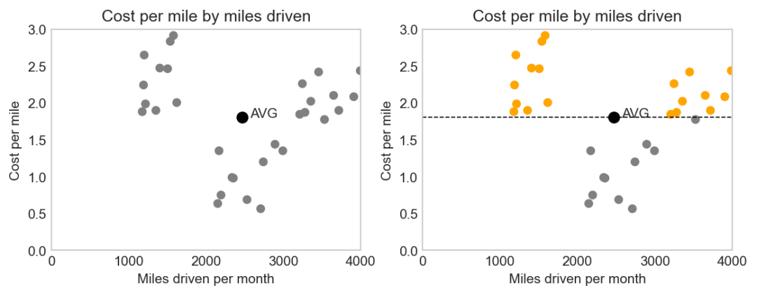
fig, ax = plt.subplots(1, 2, figsize=(9, 3), dpi=150)


"""First plot."""
# scatter plot [2]
ax[0].scatter(data_miles, data_cost, c='grey', s=30) # s parameter changes size of points
# set axis [3]
ax[0].axis([0, 4000, 0.00, 3.00])
# plot the point indicating average x and y values
ax[0].scatter(x, y, c='black', s=60)
# annotate [4]
ax[0].annotate('AVG', [x+100, y])


"""Second plot."""
# for every points in the second plot,
# color orange if it's greater than average value,
# color grey if it's greater than average value,
for i in range (0, len(data_miles)):
    if data_cost[i] > y:
        ax[1].scatter(data_miles[i], data_cost[i], c='orange', s=30)
    else:
        ax[1].scatter(data_miles[i], data_cost[i], c='grey', s=30)
# same as the first plot
ax[1].axis([0, 4000, 0.00, 3.00])
ax[1].scatter(x, y, c='black', s=60)
ax[1].annotate('AVG', [x+100, y])
# plot the line: y = average
a = np.arange(0, 5000, 1000)
b = np.ones(len(a))*y
ax[1].plot(a, b, '--', c='black', linewidth=0.8)


"""Set some formats."""
# title
ax[0].set_title("Cost per mile by miles driven")
ax[1].set_title("Cost per mile by miles driven")
# x label and y label
ax[0].set_xlabel("Miles driven per month", fontsize=10)
ax[0].set_ylabel("Cost per mile", fontsize=10)
ax[1].set_xlabel("Miles driven per month", fontsize=10)
ax[1].set_ylabel("Cost per mile", fontsize=10)
# remove grid
ax[0].grid(False)
ax[1].grid(False)
Result
Compare between a normal scatterplot and a modified one:
Reference
[1] Cole Nussbaumer Knaflic, Storytelling with Data
[2] matplotlib.axes.Axes.scatter
[3] matplotlib.axes.Axes.axis
[4] matplotlib.axes.Axes.annotate
 网站备案号:ICP备16046599号-1