本篇文章由 VeriMake 旧版论坛中备份出的原帖的 Markdown 源码生成
原帖标题为:Python Implementation on Storytelling with Data——Figure 2.8, 2.9: Line Graph
原帖网址为:https://verimake.com/topics/170 (旧版论坛网址,已失效)
原帖作者为:Felix(旧版论坛 id = 28,注册于 2020-04-18 19:59:47)
原帖由作者初次发表于 2020-10-14 16:03:30,最后编辑于 2020-10-14 16:03:30(编辑时间可能不准确)
截至 2021-12-18 14:27:30 备份数据库时,原帖已获得 1407 次浏览、0 个点赞、0 条回复
Introduction
Line graphs could be used to display several series of data, as shown in figure 2.8.
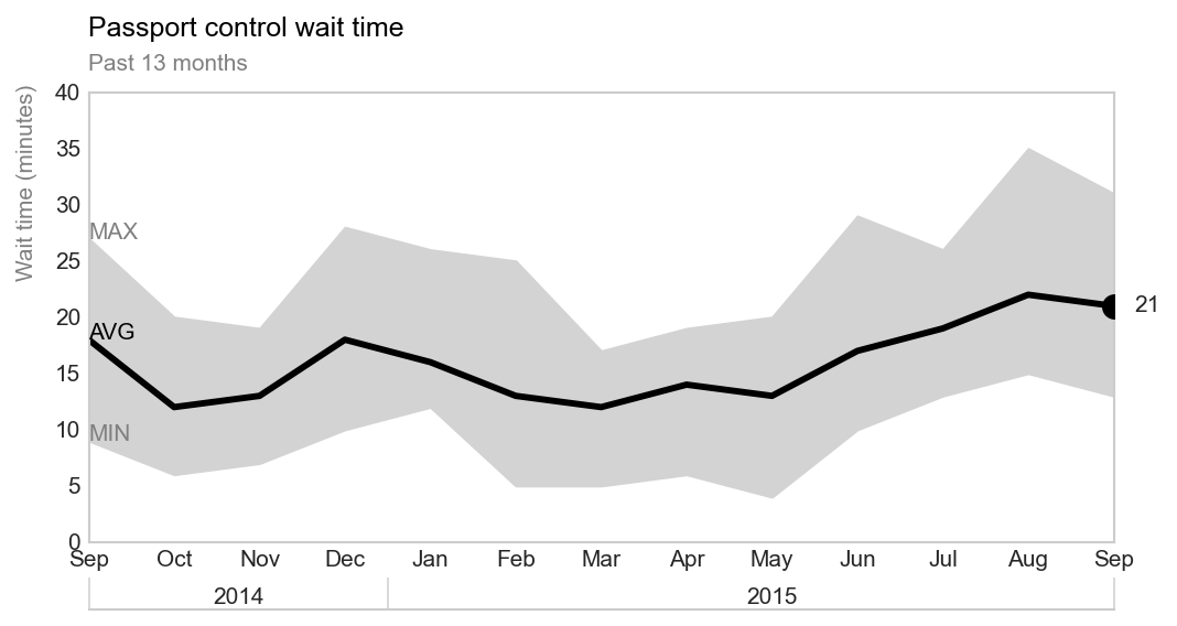
"In some cases, the line in your line graph may represent a summary statistic", and we can directly "visualizing this range" on the graph, as shown in figure 2.9. [1]
Code and Result
Figure 2.8
Import modules
import numpy as np
import matplotlib.pyplot as plt
Set style
plt.style.use('seaborn-whitegrid')
Data
Create data
We use numpy to create four series of data.
# x-value
x_data = ["Jan", "Feb", "Mar", "Apr", "May"]
# y-value
series_a = np.array([4, 3, 4, 4, 7])
series_b = np.array([2, 4, 3, 6, 6])
series_c = np.array([2, 2, 3, 4, 5])
series_d = np.array([3, 4, 4, 4, 4])
Plot
Define plot function
def plot(subplot, x_data, y_data):
    """Plots one or multiple series of data as line graph."""
    ax[subplot].set_ylim(0, 8) # set y-axis range between 0 and 8 [2]
    # for all series of y-data
    for data in y_data:
        # plot series-a and other three series differently
        if data.all == series_a.all:
            ax[subplot].plot(x_data, data, color = "royalblue", linewidth = 2.5, zorder = 3) # plot series-a in royalblue and ensure it at the top [3]
        else:
            ax[subplot].plot(x_data, data, color = "lightgray", linewidth = 2.5) # plot other three series in lightgray

    ax[subplot].grid(False) # remove grid
Plot
fig, ax = plt.subplots(1, 3, figsize = (8, 2), dpi = 150)

# call function, y_data input is a list
plot(0, x_data, [series_a])
plot(1, x_data, [series_a, series_b])
plot(2, x_data, [series_a, series_b, series_c, series_d])

# set title, set fontsize and location [4]
ax[0].set_title("Single series", fontsize = 10, loc = "left")
ax[1].set_title("Two series", fontsize = 10, loc = "left")
ax[2].set_title("Multiple series", fontsize = 10, loc = "left")
Result
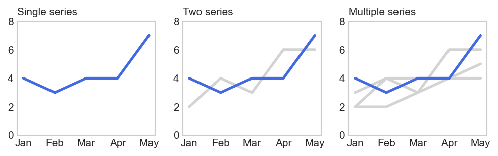
Figure 2.9
Import modules
import numpy as np
import pandas as pd
import matplotlib.pyplot as plt
from matplotlib.ticker import FixedFormatter
Set style
plt.style.use('seaborn-whitegrid')
Data
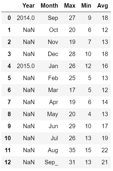
Import and process data
data = pd.read_csv('D:/programming/dataset/storytellingwithdata/project/data2.9.csv')
data = data.rename(columns = {'Unnamed: 0': 'Year', 'Unnamed: 1': 'Month'})

# x-label
x_ticks = data["Month"].tolist() # ["Sep", "Nov", ... , "Sep"], two "Sep", labels shown on the final result

# x-data
data["Month"][12] = "Sep_"
x = data['Month'].tolist() # ["Sep", "Nov", ... , "Sep_"], use "Sep_" to represent the second Sep, used to plot data but not shown

# three series of y-data
y_max = data['Max'].tolist()
y_min = data['Min'].tolist()
y_avg = data['Avg'].tolist()
Data preview
Plot
fig, ax = plt.subplots(figsize=(8, 4), dpi=150)

"""Plot three series, use x to plot."""
ax.plot(x, y_max, linewidth=0)
ax.plot(x, y_min, linewidth=0)
ax.plot(x, y_avg, c='black', linewidth=2.8)

"""Mark the last data point."""
ax.scatter('Sep_', 21, c='black', s=100, zorder=10)
ax.text(12.4, 21, '21', horizontalalignment='center', verticalalignment='center')


"""Label x-axis only based on position, not value, use x_ticks to label. [5]"""
ax.xaxis.set_major_formatter(FixedFormatter(x_ticks))

"""Fill in color between min value and max value. [6]"""
ax.fill_between(x, y_min, y_max, color='lightgrey')

"""Label three series."""
ax.text(x[0], y_max[0], 'MAX', c='grey')
ax.text(x[0], y_min[0], 'MIN', c='grey')
ax.text(x[0], y_avg[0], 'AVG', c='black')

"""Set title."""
ax.text(0, 45, 'Passport control wait time', c='black', fontsize=12)
ax.text(0, 42, 'Past 13 months', c='grey', fontsize=10)

"""Add a second x-axis. [7]"""
fig.subplots_adjust(bottom=0.2)
ax_ = ax.twiny()
ax_.xaxis.set_ticks_position("bottom")
ax_.tick_params(axis='x', direction='in', length=14, color='lightgrey')
ax_.spines["bottom"].set_position(("axes", -0.15)) # Offset the twin axis below the host
ax_.spines["bottom"].set_visible(True)
ax_.set_xticks([0, 3.5, 12])
ax_.set_xticklabels([]) # no default x-axis label
ax.text(3.5/2, -5.5, '2014', horizontalalignment='center') # x-axis label
ax.text(8, -5.5, '2015', horizontalalignment='center') # x-axis label

"""Other settings."""
ax.set_ylabel('Wait time (minutes)', fontsize=10, c='grey')
ax.yaxis.set_label_coords(-0.05, 0.8)
ax.set_zorder(1) # default zorder is 0 for ax and ax_
ax.axis(['Sep', 'Sep_', 0, 40])
ax.grid(False)
Result
Reference
[1] Cole Nussbaumer Knaflic, Storytelling with Data
[2] matplotlib.axes.Axes.set_ylim
[3] matplotlib, zorder demo
[4] geeksforgeeks, matplotlib.axes.Axes.set_title
[5] matplotlib.ticker.FixedFormatter
[6] matplotlib, filling the area between lines
[7] stackoverflow, how to add second x-axis at the bottom of the first one in matplotlib
 网站备案号:ICP备16046599号-1